Case studies > Outinvoice

Case Study: Website Redesign for OutInvoice

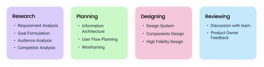
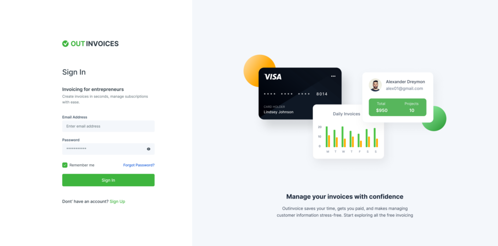
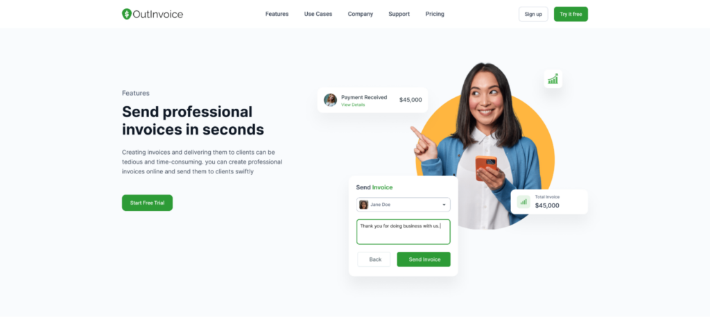
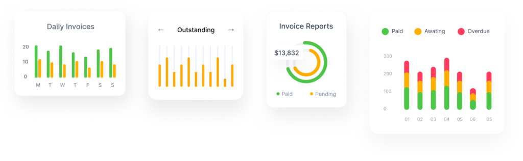
Let’s take a look at a web design for a product in the financial and payments industry. This case study tells the story of a creative landing page design for the website of Outinvoice, an invoicing software.

Client & Project

OutInvoice is an invoicing Software helping small business with billing and payments all in one place. The mission of Outinvoice is make all billings and payments organizable and easy to track. It has various features like professional invoices, online payments, and automated payment reminders.

The goal was to modernise the overall look of the website and improve the user experience. And to highlight the key features of the products.

Problem Statement

By modern standards, websites need to be clean, consistent and clutter-free. The initial website of Outinvoice had ads all over the place, dull color schemes and a general lack of cohesion between pages. Users also need to know that they’re on the same website when navigating between pages, so it is necessary to keep primary design language consistent.
The content, layout and design elements of the website was very poor and did not showcase all the features of the app. Hence, couldnot capture visitors attention.

Goals and objectives

The goal to create a visually attractive and effective website that would take less time to maintain, be more user-friendly, and boost user experience.

  • To communicate credibility
  • Attract Customers. We all know that first impressions count
  • To ensure usability
  • Be Easy to Navigate
  • Highlight the features of the product

Target Audience

Established businesses of more than 50 employees that value an accounting firm that offers comprehensive business planning services, particularly those in the medical/health, dental, and lodging industries.

In 2020, the use of cash declined among consumers of all ages. However, those 65 and older used it the most with 26% using cash, followed by 23% of those 55-64, 20% of those 18-24, 17% of those 45-54, 16% of those 35-44 and 11% of those 25-34.

  • Age : generally 25 – 40
  • Gender: All

Research & Competition Analysis

The first stage of the creative process was the research phase. In this stage, I focused on target users and their requirements, to add realistic contexts and insights to design processes.

In addition to the original site’s UX audit, I looked at the websites of other competitors. Not only to comprehend the positioning, but also to observe industry-wide design practices. I wanted to know what they were doing right or wrong.

Information Architecture 

I focused on developing an Information Architecture because content is the reason why people visit websites. And it is important to produce content that users will find valuable, but what’s equally important is to make sure that the content is easy to find.

Homepage:  The layout of the landing page is focused on grouping the content into different sections, each of which presents the product’s Features. Visitors are shown the application’s interface via a variety of visualization approaches.

Features:  As the name suggests, various features of the product is highlighted. There are total 6 different features of Outinvoice and they are disucced in their individual pages.
 

Usecases:  Use cases explain how and why customers will use the product. Outinvoice has a total of four different usecases, each of which is detailed on its own page.

Pricing:  It explains monthly and yearly pricing plans of the product. So that users can select the right plan suitable for their business.

Blog: Blogs page highlights Latest articles and blog about invoice. 

Web Design

After the analysis and some research, I started to construct the design system for the project. A design system is a collection of reusable functional elements–components and patterns–guided by clear standards that product teams use to create a consistent experience across a range of products.

I started with the colour palette and fonts. Outinvoice has green as its brand color, and the goal was to create a positive perception of the product. Hence, I pared it with a bright yellow color.

Primary Color:  Green
Secondary Color:  Yellow

The hero section of the page shows a mobile interface of the application interface. The credit card graphic creates an immediate visual link to the service being delivered and complements the tagline’s meaning. The aspects of the call-to-action are distinct and stand out.

UI Decisions

Working on the project, I wanted to make the users more visually aware about the interface of the software. For that reason, I have made maximum usage of a variety of visaualization approaches.
Also, there’s an introductory video of the software below the hero section. Videos keep people on your website longer and engage them with your content as it is well known that videos can communicate a lot easier than to learn just in text format.

Handing Over To The Developers

I spent a lot of time describing the user interface so that the developers could understand how to code it. Despite the fact that I’m working with Figma and it’s quite easy to export the code, having a reference point is always useful.

Copyright © 2022 Aarju Mainali. All Rights Reserved.